20 July 2026
Design Philosophy
I struggle with contemporary web design. For numerous reasons, the endless pressure for apps to conform to various design trends is not only a misinterpretation of what design’s aims are, but also how to use it for the specific ends of an application. The general tension between print design and web design may never leave us, and the legacy of software interface design to this point is checkered, to say the least, but I can’t shake the feeling we’ve lost the thread while also conflating User Experience and User Interface Design.
A personal website is in a novel position; namely it’s a website and not an app. Apps present a specific aim to users, and use their design to deliberately guide people through the features and functions without confusing or distracting them. My personal website has no such aims. In fact, I consider my aims to be the entire opposite. Parrot.Zone is intended to be a place where I can put my full self on display–showcasing my hobbies, passions, interests, and philosophies. To that end, I wanted the site to invoke the same kind of curiosity I bring to normal human interactions. When I meet a new person, I want to ask questions, dig into things, see where conversation threads lead, and so on. I wanted browsing my website to feel that same curiosity. To that end, the entire goal of the site’s design is to entice people to explore, click around, and discover.
Guidelines
I had a couple of core aesthetic themes I wanted to invoke throughout the design, and through numerous iterations, I settled on the following:
Each top-level page should feel somewhat unique.
While I had no desire to create unique and wholly novel designs for each section, I did want each section to feel special and distinct. The main way I ended up accomplishing this is by assigning each section to a specific color within the overall palette. The other distinguishing factor is most sections own a novel interaction pattern, and for sections which don’t, they at least have unique information architectures.
Inspiration
I’m a Millennial, raised by computers and video games, and I wanted to reflect that in the design. I did a lot of fun reminiscing about so-called retro interfaces, jukeboxes, WinAmp skins, and video game menus, and I was struck by a memory of Playstation Demo Discs.


These things were the highlight of my life. Free CD’s that had multiple games on them! Of course they were demos, but sometimes they were good demos, and sometimes even worth replaying. There was a certain novelty to it all, and they all came with such unique personalities, design wise. The menus were always these strange, bespoke, branded affairs trying their best to entice you to try each game on the disc, while also letting you know who fronted the cash for your free ride.
Photography
I take photos sometimes. I have a lot of photos I’m proud of, but none of them live anywhere, and I’ve never found a great way to feature them. I don’t have a large enough library, nor do I do photography often enough to warrant a separate section on the site, but given the site is all about me, I wanted to integrate art I was proud of wherever I could. Each page has a unique background image, all of them are photographs I took. I processed each image in Aseprite, indexing the colors to the site’s global color palette. It’s honestly my favorite little touch on the site, and I hope you like it too.
The Nav
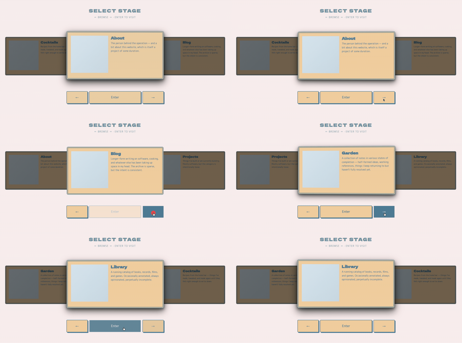
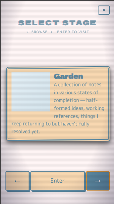
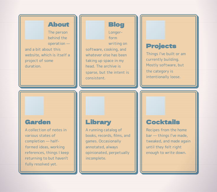
The nav was my favorite part to work on, and it went through numerous iterations. My original idea was to emulate a Jukebox, like, a real one, like you’d find in a diner or something, but that became incongruent with the retro CRT aesthetic immediately, and I remembered these demo disc menus for having such a similar pastiche, while also serving the same general purpose of letting people select from a set of choices.
A complexity of the nav was making considerations for non-JavaScript environments, as well as A11y concerns. I think I ended up with reasonable solutions for both, but I’m sure I’ll find out where I went wrong at some point.